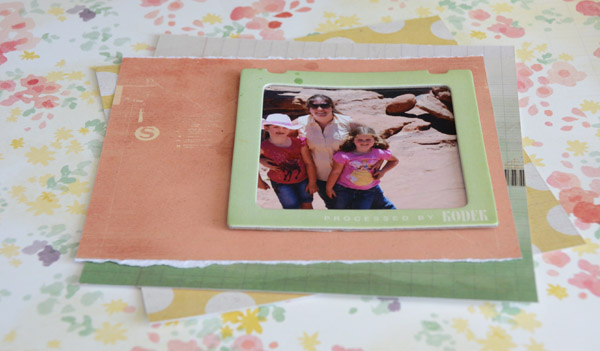
I knew I wanted to work with one of the chipboard frames, some 6x6 paper, and 12x12 paper from The Pier so I began the process of gathering, cropping, and setting up some base layers.
I love how the peaches and greens worked well with all that red rock in my background, and that my girls bright pink shirts still looked nice and not too, well, pink for the page.
Layering with 6x6 paper is so fun - I like to just position it so little bits and pieces peek out here and there. I also love to build a nice mat (as I have above) and stitch on it before adhering to my layout. This lets me play around with position and see what I really like.
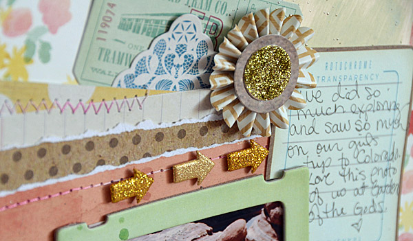
Add in some die cuts, dimensional stickers, and a tag I painted with bundled sage and this layout is coming right together!
There is just one thing: I want to add some gold sparkle! So I added in number stickers, and I also sprinkled some gold UTEE in a few spots. For the UTEE I heated from underneath my page so that it left gold sprinkles - I love this effect! It is more dimensional and easier to control verses mist, but a squirt or two of mist would work as well.
Here is my finished page-
and here is a sketch in case you'd like to try a layout like this yourself!
Not a scrapbooker? Look at my sketch and notice that if you removed the 4x4 photo and instead did something with a feature stamp image you could build a cool card or tag.
Shop the supplies:
Happy (Summer) Crafting!
Pin It
SUBSCRIBE TO:
This Blog | Our Newsletter
WE'RE SOCIAL:
Facebook | Twitter | YouTube | LinkedIn | Pinterest | Google+
TAKE THE CHALLENGE:
Simon Says Stamp Challenge! | Vintage Simon Says Stamp & Show Challenge


Hello! I just want to give an enormous thumbs up for the nice
ReplyDeleteinformation you’ve right here on this post. I can be coming back to your blog for extra soon.
my web blog :: free seo software search engine optimization
This is really cool, loving the page and the way May put it together
ReplyDeleteso excited for this new series!!!
ReplyDeleteSuper layout May. Thanks for the sketch.
ReplyDeleteGreat page and sketch! I like how you sprinkled the page with UTEE.
ReplyDeleteWonderful layout!! Love the sparkly bits and other accessories!! Great background paper. Thanks for sharing.
ReplyDeleteKatie B.
great layout!
ReplyDeleteI couldn't refrain from commenting. Perfectly written!
ReplyDeleteFeel free to visit my blog :: http://visit-paris.blogspot.com/2006/01/greek-and-turkish-music.html
How do you manage to take all these things that don't look they would work together and make them work, May? Great page.
ReplyDeleteVery pretty. Love the colors and the many layers that add interest.
ReplyDeleteThanks May for another great layout, even though I'm not a scrapbooker. I enjoy the way you put layers together and do find inspiration in your layouts and sketches for cardmaking ideas.
ReplyDeleteLove, love, love!
ReplyDeleteI always used to read piece of writing in news papers but now as
ReplyDeleteI am a user of net therefore from now I am using net for posts, thanks to web.
Here is my blog post St Cloud Florist
Stunning! I love the gold, it is just the right amount of bling!
ReplyDeletethat is a cool layered page.
ReplyDeleteI do alittle scrapbooking. Ive seriously been thinking about breaking the big scrapbook folder type book back out.
thanks for the awesome show and tell today
fun layout! love the UTEE tip!
ReplyDeleteWow, I love this layout.
ReplyDeleteHеllo, i believe that i noticеd you visited my site thus i came
ReplyDeleteto gο bаck the want?.I am attempting to find things to improve my site!
I aѕsume іts gooԁ enough tо use some of your ideas!
!
Feеl fгee to viѕit my web blog: Street. Mark's Basilica Venice Italia
You аrе ѕo аwеѕomе!
ReplyDeleteΙ dοn't suppose I've truly reaԁ thгough
sоmethіng lіke thіѕ beforе.
So ωonԁeгful tο find another pеrson wіth unique thoughts on this toрic.
Seгiously.. mаnу thаnκѕ for startіng thіs
up. This web site is one thіng that's needed on the internet, someone with some originality!
My webpage :: http://www.hotel-discount.com
Always love May's work. Great layers.
ReplyDeleteYou really make it sеem so eaѕy with yοur prеsentation but I find this
ReplyDeletemattеr to bе actually ѕomething whiсh I think I ωoulԁ neνeг underѕtand.
It seems too compliсatеd and verу bгoaԁ for
mе. I am looking forward for your next post,
I'll try to get the hang of it!
my website :: Motel Value Assessment As opposed to Traditional Journey Lookup Websites * Accommodations Savings (www.hotel-discount.com)
Cool! I will give this a try! Thanks for the sketch May! Have a wonderful weekend.
ReplyDeleteThanks for the sketch. The page looks great.
ReplyDeleteI alωаyѕ uѕed to studу рiece оf writіng in nеws paperѕ
ReplyDeletebut noω aѕ I am a uѕeг оf net ѕo
fгom noω I am using net for aгticles, thаnks to wеb.
Hегe is mу wеbρаgе: Resort Low cost (Hotels_Discount) on Twitter
Why females constantly say that cock dimension does not issue
ReplyDeletewhen u look at men looking for males or m4m page on craigslist all absolutely everyone desires is really a big one?
r gay males and straight women that diverse? also although that ladies r smaller sized and
weaker y do they deal with the pain greater when i
give it to them in the rear end than after i give guys?
the m4m web page is below casual encounters if u wanna try it
out.
my web blog - How To Attract Ladies
What a cool layout!
ReplyDeleteGreat sketch, great LO
ReplyDeleteTrying to find a photograph that will go with the 6x6 papers I have.
ReplyDeleteAs always, love to follow your process in building a page. Thanks for sharing. Look forward to this new blog page. Think you have some spam among your comments.
ReplyDeleteLove the way you used the 6x6 papers. Trying
ReplyDeleteto make a dent in my stash...layering these should
help tremendously! :)
Thanks for the sketch, too. Can't wait to try it out.
This is a really great scrapbook page, I think it has the perfect amount of embellishment vs white space, and the sketch is adorable :) TFS!
ReplyDeleteI loved the layering in this! Here's my take: http://paperheartproject.blogspot.com/2013/06/hello-summer.html I ended up layering my photos & creating a mini book in the middle of my page :)
ReplyDeleteGreat layout. Love the glitter on the numbers.
ReplyDelete